
When a Consumables Supplier Needed More Than a Quick Weld
OVERVIEW
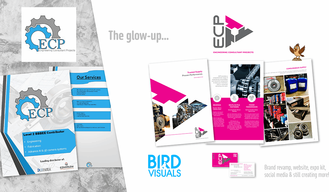
Imagine a consumables supply company trying to look the part in a tough local industry… but instead looking like the bargain-bin version of itself. Their online presence? Practically rusted shut. A sad Facebook page no one followed, a lonely Google Business listing that might as well have been a ghost ad and a “company profile” that read like it was done on a Sunday afternoon with zero caffeine and too much Microsoft Word.
And let’s not even talk about the logo. Copy-paste, cookie-cutter, utterly lifeless. Bearings, welding consumables, bolts and fasteners deserve better than that.
Now, there’s nothing wrong with giving branding a DIY shot (many businesses start there), but when you’re competing in an industry as tough as engineering supply, a polished and strategic brand presence isn’t optional, it’s survival!
THE GOAL
New management stepped in: young, energetic, experienced and determined to show local
businesses that the old ways (and old rep) were gone. They wanted to reintroduce themselves as a serious player in the market, but had no clue how to shout it from the rooftops.
CALL THE BIRD VISUALS RESCUE UNIT!
We rolled up our sleeves and went full fabrication mode:
• A bold new logo: Proving pink can earn respect in mining & engineering.
• Brand evaluation + full implementation: Out with the old clutter, in with a clear story.
• Social media revival: Facebook revived, Instagram and LinkedIn launched.
• No more digital tumbleweeds. Website redesign: Functional, bold and finally matching the
calibre of their services.
• Graphic design (all of it): Business cards, letterheads, company profile, signage, NCR
books, stamps, stickers, emailers, WhatsApp templates… you name it, we designed it.
• Sales strategy support & training: Because a polished brand still needs a sharp sales
edge.
THE RESULT
The company went from “barely visible” to “unmissable.” Local businesses stopped associating them with the old, failing management and started seeing a renewed, professional supplier ready to partner with mines, workshops and engineering firms alike.
What started as a tired consumables brand got rebuilt. Stronger, bolder and with just enough pink to stand out in a steel-and-dust world.
CLIENT TESTIMONIAL
Since taking over ECP in 2022, my mission was to transform the business into Middelburg’s go-to
supplier for bearings, fasteners, welding equipment and consumables. Bird Visuals brought that vision to life. Their creative firepower gave ECP the bold, energetic edge it needed – from a modern logo and striking expo displays to a dynamic website and cohesive brand design. They didn’t just rebrand ECP, they helped relaunch it with purpose, personality and presence.
Hester Bird (Managing Director)